The design process for Prime Supplement began with deep research into the health and fitness market. We studied competitor packaging, customer preferences, and trends in the supplement space. Based on that, we created a mood board to define the visual direction—clean, modern, and high-performance.
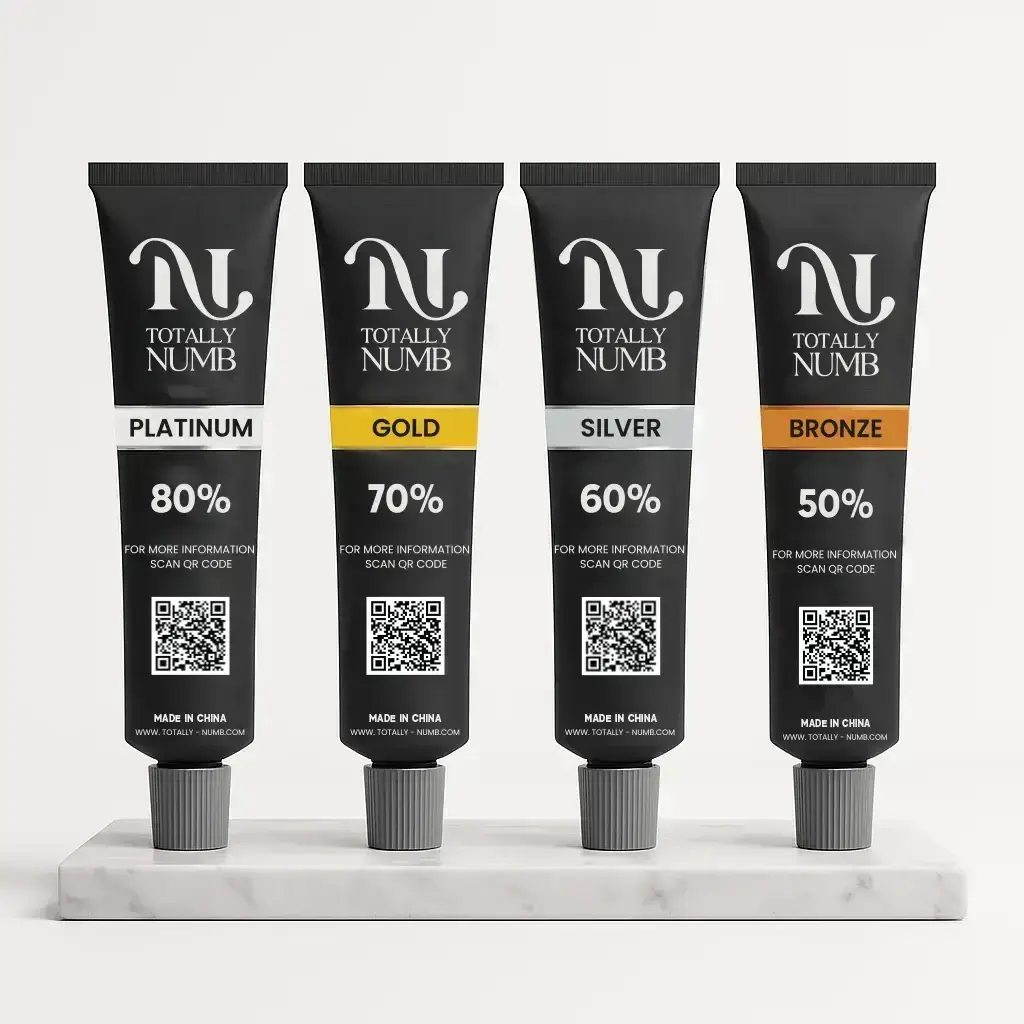
Next, we explored typography, colors, and layout styles that reflect strength and trust. The final design used bold fonts, minimal icons, and sharp contrasts to create a premium feel. We also focused on a clear information hierarchy to help buyers quickly understand the benefits and ingredients.
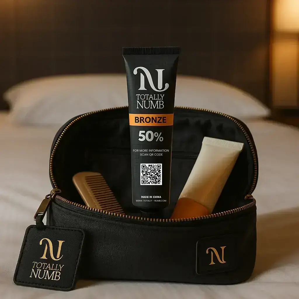
Throughout the process, we made sure the design looked strong both online and on shelves. Every detail was tested for balance, clarity, and brand consistency.
PS: Mockups were created using AI for presentation only.