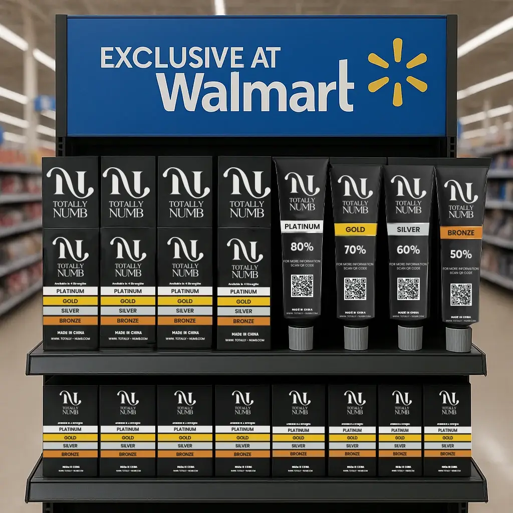
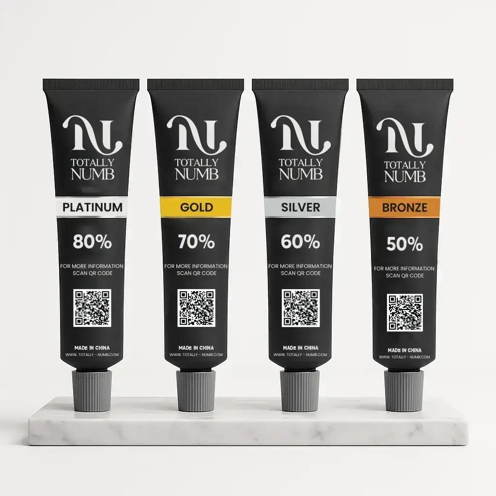
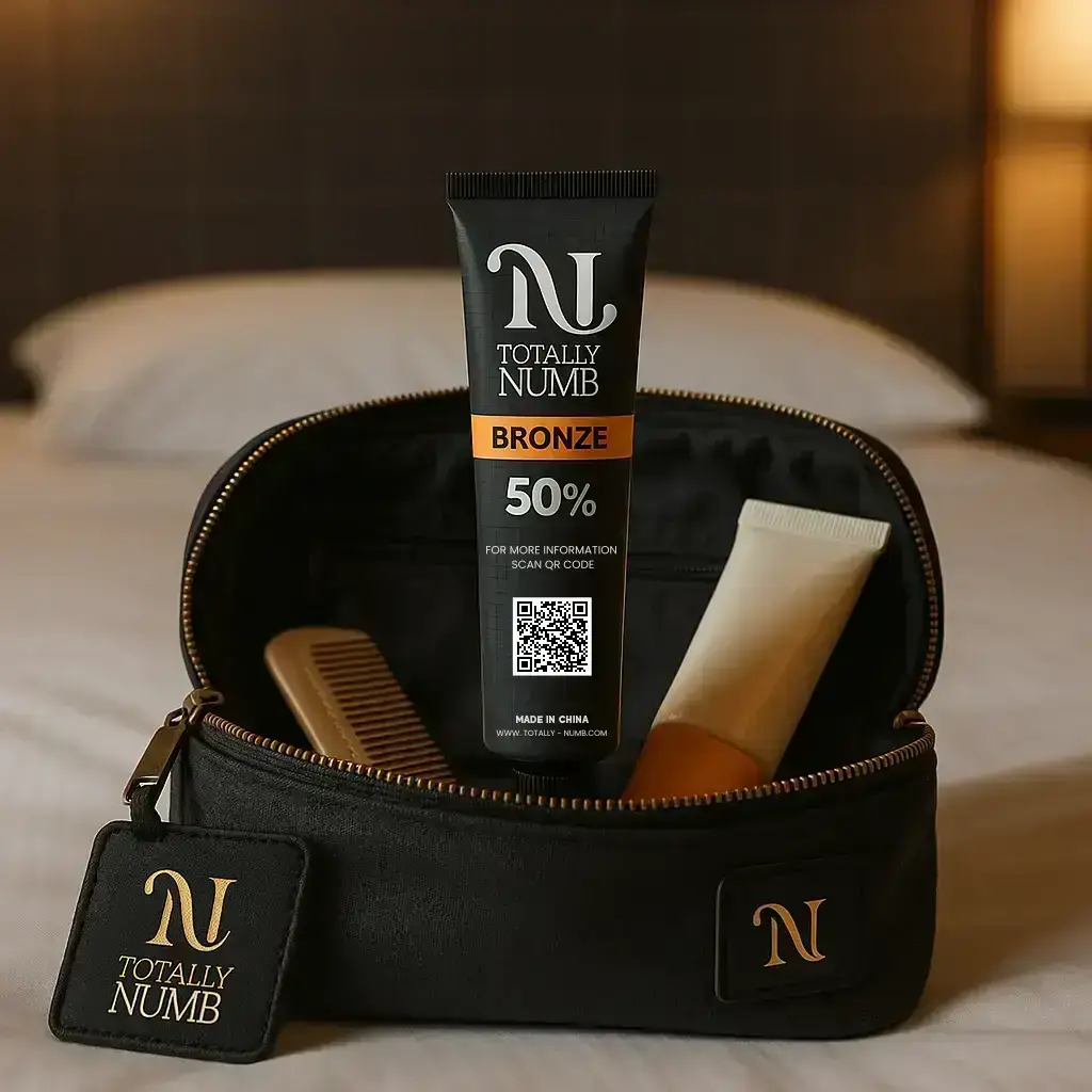
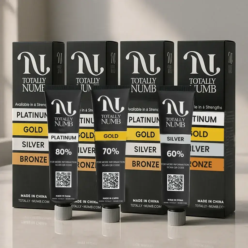
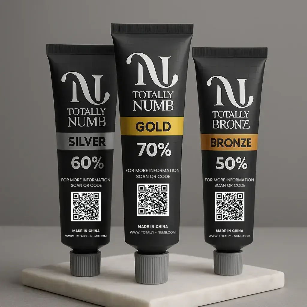
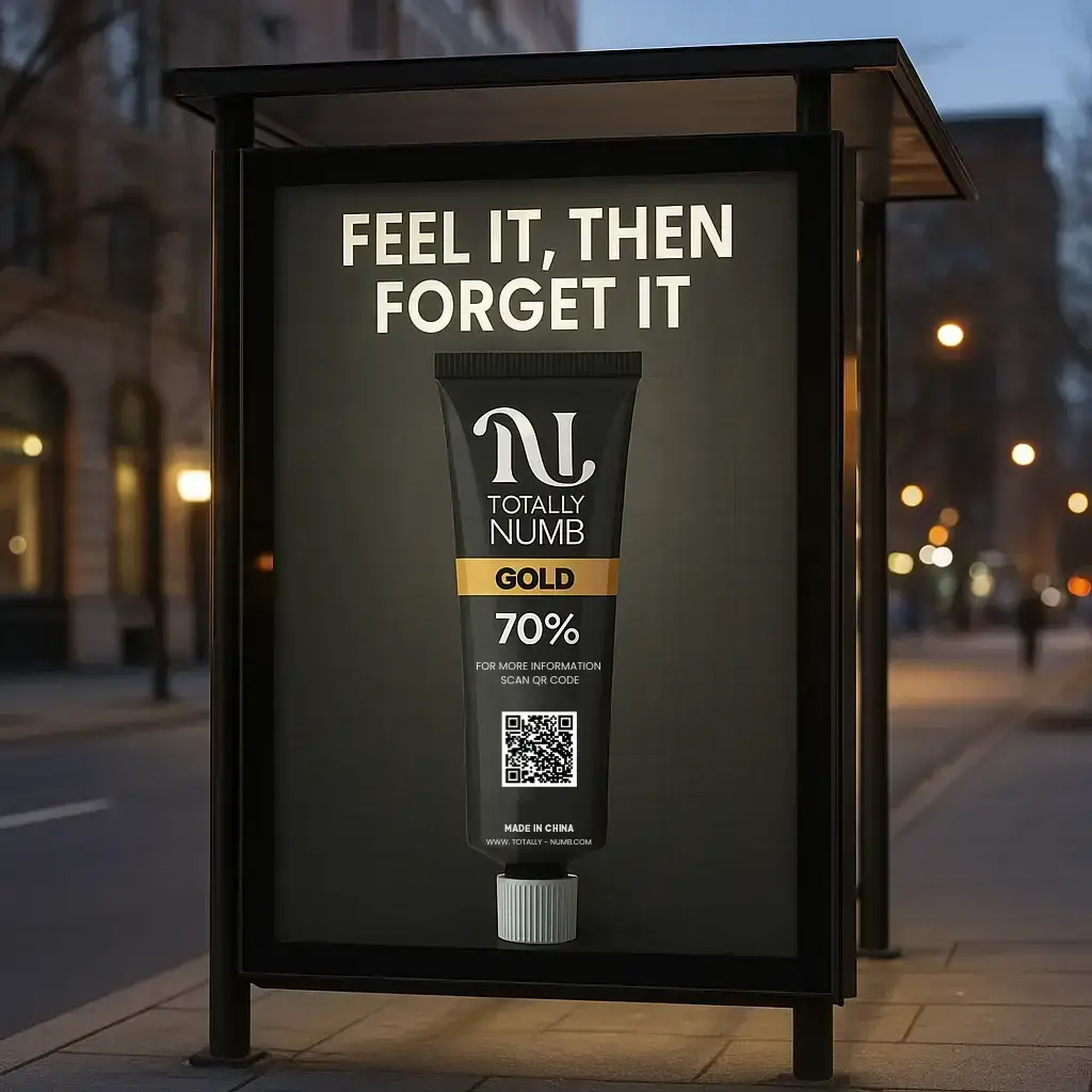
The design process for Totally Numb started with understanding its bold purpose—fast, powerful relief. We researched similar products in the personal care space to find gaps and opportunities. From there, we built a design direction that felt strong, clinical, and trustworthy.
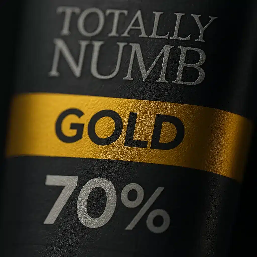
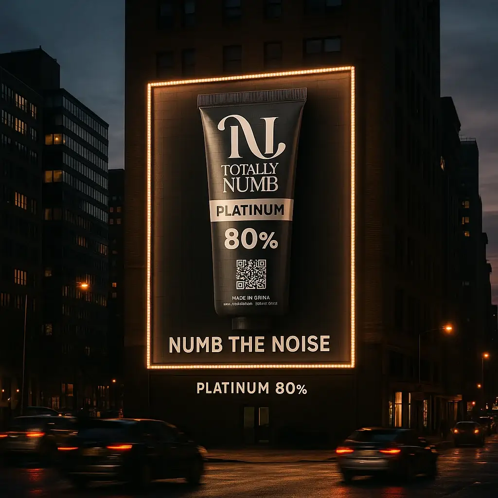
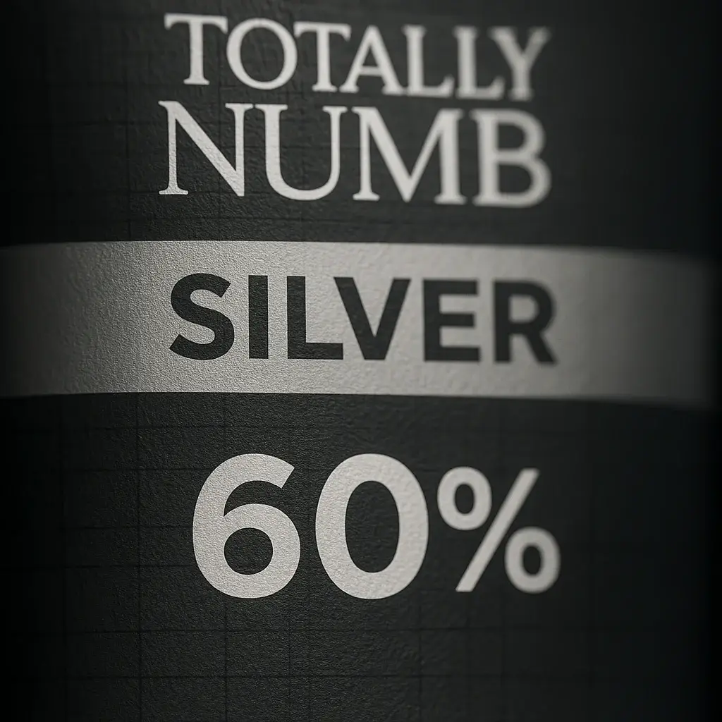
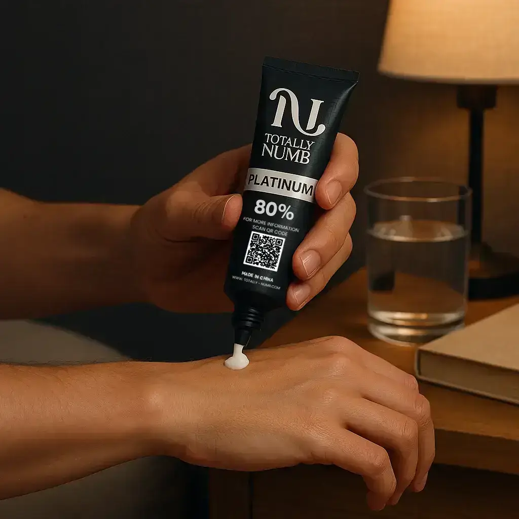
We used high-contrast colors, sharp typography, and clear icons to reflect confidence and precision. The layout was designed to highlight key benefits and safety information at a glance. Every element—from the logo to the label—was crafted to feel bold, clean, and professional.
The final result is a sleek, no-nonsense design that stands out on shelves and builds instant trust.
PS: Mockups were created using AI for presentation only.